
I captured this image of a frosty yesterday morning on the edge of a car park. It did raise a few eyebrows from passersby. My initial intension was to convert it to a black and white image using Nik Silver Efex Pro. I made a few variations of the image using different conversions, some high key some low key and some high contrast but none ticked the box for me.
Then I remembered a new Nik programme that I had downloaded whilst trying to fix a problem with Lightroom 5.2 (still not fixed) and thought I would give it a go. The filter is called Analogue Efex and allows you to simulate all sorts of camera and film effects. Usually I am not impressed by such applications and to be honest, looking through the presets I wasn’t hopeful. I then found the custom sections where you can create your own effects and the image below was the result. I produced both the colour version and then converted this to the black and white version above with Silver Efex Pro.
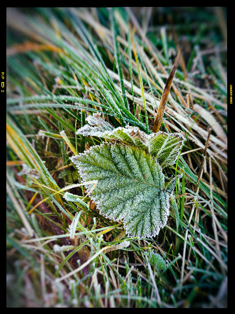
I have made prints from both and the prints are excellent quality but I don’t know which I prefer. I think I am edging towards the colour version but then I switch to black and white. I was wondering what others thought – my wife dismisses anything black and white immediately so if you have similar tendencies your immediately banned from commenting.
Does anyone have any thoughts?
I almost forgot, there also seems to have been other updates installing themselves in the background. This includes a few presets for different applications but I also noticed the grain simulation is now superb. It looks completely natural and is so much better than before. I actually find myself wanting to add grain.

Go with the colour! Looks awesome.
Thanks. I’m sat looking at the prints in my window light and the Colour looks most natural.
I too think the coloured image.
I feel there is too much going on in the black and white image with all the grass in the background and the leaves do not provide enough tonal contrast to hold my attention.
With the coloured image I would have removed the brown/black piece of grass above the top leaf as I find this distracting
Thanks for your vote David. I agree the brown piece of grass can be distracting but I also think it makes it look natural. Don’t give me two decisions to make.
I like the b&w. I think it better captures the chill in the air. Maybe it the leaf were brown or red, I would feel differently.
Thanks. This makes me think that I should reduce the colour temperature in the colour image slightly. I might try this later to see if it improves the feel.
I was considering ‘banning’ myself on the opposite grounds to your wife given I do generally favour mono so I won’t express a preference but just as a thought you may like to consider using Silver Efex #12 – Push Process to increase contrast.
Thanks Steve, Strangely this was one of the presets I looked at but felt it increased the contrast too far for what I was trying to achieve. I might go back and experiment a little more as my first attempt was from the original image and not the version that had been through Analogue Efex.
Well, I will go against the others and say the B&W. I think it shows the feeling of cold better. Additionally I would darken the backround leaves a bit, to give the cental leaves more presence and I would then tone the picture a slight blue to enhance the cold feeling more.
Thanks for your comment. I did try burning the edges but it seemed to lose a little. This one has actually been lightened around the edges. Again, I just preferred it at the time. I will give the blue tint a go see how it feels.
For me definitely the black and white wins hands down but then I am of an age where we were brought up on this medium . I like colour but good b/w when it is good always retains my heart.
May I say how much I enjoy your lightweightphotographerpresentations.
Thanks for your thoughts. Sounds like your the oposite of my wife but I don’t blame you as I also love Black and White. Thanks also for the positive feedback on the blog.
This is a tough choice, but I am going to go with the black and white.
It’s really beautiful, and I love the detail.
Thanks Lisa
I have to go with the color one here Robin. I think the subtle gradation in color makes for a stronger image than the B&W version. My wife is similar to yours I guess, it takes a REALLY strong black and white image to sway her!
As for the Nik software, I found that I am now unable to use Silver Efex 2, Color Efex 4 or the Analog Efex ever since they “updated” it, due to my graphics processor. My computer isn’t that old and they just made it obsolete. Having just updated my modem and bought new external hard drives I am not in the mood to spend even more on my PC right now so, for the time being, I am using Topaz Black and White, which is versatile and usable, but I did like SEP2 for it’s speed and ease.
Thanks David and also for the details about your Nik problem. I hope it’s not a Graphics card issue as this is a new PC using an expensive Graphics Card upgrade. The entire thing was custom built and cost an arm and a leg. It’s super fast but that’s useless if it the software deosn’t work.
I much prefer the B&W version. Why? The colour version’s vegetation looks very untidy what with live, dying & dead parts all over the back ground, going in all directions which takes the eye away from the centre frosted coloured leaf. You loose this appearance in the B&W version plus the frost detail is much more prominent in this version. Detail over all the image is much better defined in the B&W image.
Thaks for your thoughts Paul. You made me think of an idea for tonights blog post.
Robin,
I Prefer version 4 myself, but this is just my preference. Sometimes you can have too many choices though. I think a toned B&W version would look good. Because of the frost maybe a blue tone.
Regards,
Alan
Ah! A kindred spirit. I must try this sort of experiment more often. Thanks for the feedback.