Yes, I know that I keep going on about using emotional triggers in photography but it’s a fascinating subject. It’s also a great way to make ordinary images more interesting. And if you want to consider yourself as more of a visual artist than a photographer, I would say it’s pretty much essential.
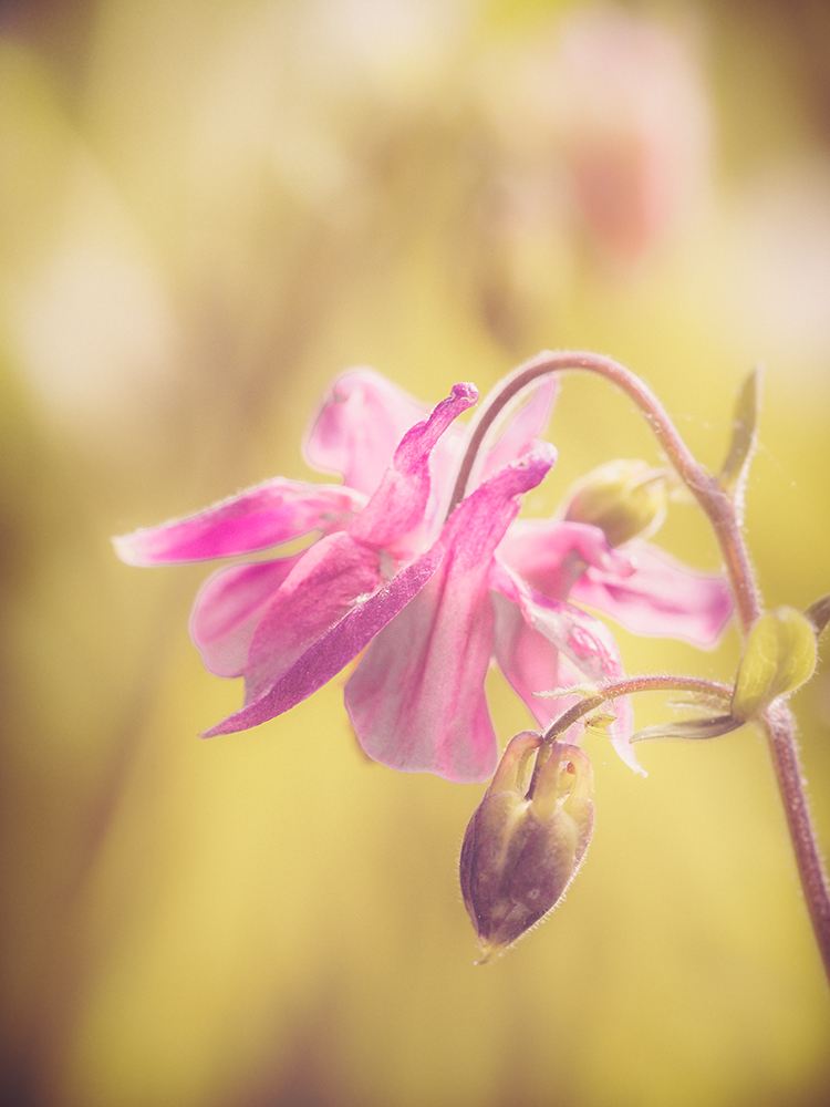
Today’s example shows the creative impact colour and tone shifts can have. For your reference, the original image is shown below.

The global changes I have made are to the colour, exposure and the contrast. I have also increased the clarity in some areas of the flower using the Lightroom Brush tool. If you look carefully on the lower stem above the bud, you will find a greenfly hanging upside down. I thought twice about removing it but decided to leave it in.
If I were to produce this as a finished arty image I would probably blend the image with a textured background to add even more appeal. But as this example is about colour and tone, I have restricted the adjustments to exposure, contrast and colour. If you are wondering which tools I used to make all these changes, everything was done in Lightroom.
If you are a Lightroom user who likes the image and are interested in recreating the look with some of your own work, please let me know. If it’s a popular adjustment I will make it available on my Lenscraft site as a Lightroom Preset that can be downloaded.

I’ve not been sure about some of the previous “emotional” images but, for whatever reason, this one works for me.
Thanks Andrew. I can understand some of the images not appealing to people but I’m pleased this one connects.
Great work. Yes, I would like to know how you did this.
Thanks Don. THat’s good enough for me. I will publish the preset shortly so anyone with Lightroom can recreate this.