Over recent years I have noticed an increasing trend towards what I would call Unbelievable Realism in photography. To my mind, this is most noticeable (and objectionable) in the area of Nature and Landscape Photography.
If you are wondering what I am talking about, it’s the amazing colours and saturations that seem to dominate, increasingly dramatic images. I have a friend who calls this fast food photography and I have to agree. I look at a series of these photographs and find myself skipping through, quicker and quicker, trying to get to the next one to see if it is even more dramatic. At the end, I feel exhausted but strangely never fulfilled. There is seldom more to these images than the immediate hit of colour.
It’s easy to see why this is happening. In the days before digital, you had to work the magic in camera. It was a skill you developed along with your eye for a good image. Now, you still work the magic in camera but it’s only part of the story. For example, if you shoot RAW you can’t stop with the in camera image or it looks dreadful (especially if you use techniques like exposing to the right). At the same time, software for manipulating the images has become increasingly advanced, capable and in some cases easy to use. Magazines and website are also flooded with such images so those new to photography see this as what they need to aspire to rather than developing their own vision.
As a user and enthusiastic advocate of plug-ins, I have to admit that these may be causing part of the problem. These tools make it very easy for people with little experience (who also may not have developed their personal vision/eye yet) to produce dramatic effects. I too have found myself guilty of creating images that have too much impact at times and stray into the area of unbelievable realism. It’s very easy to push those sliders just a little too far and not realize you are doing it until it’s too late.
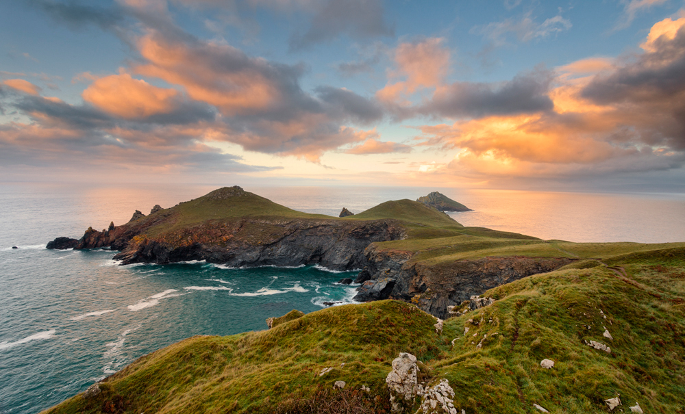
What I would like to propose is an alternative approach to Landscape and Nature photography where we try to keep it real. In the picture above you can see an image that I have tried to process a number of times. The difficulty I have experienced is that the image, no matter how I process it, has never appeared real to me. Often the grass comes out too green, the sky too blue or the sunset too orange and saturated. The subtlety of colour and the balance between the colours just isn’t right. What unfortunately I am missing is a good reference point to work from. So far the above example is the best I have been able to produce but I think it’s a work in progress.
To end, I would like to pose two questions to anyone reading this:
- Which approach do you prefer when looking at other peoples work, the drama of “Unbelievable Realism” or the subtlety of “keeping it real”?
- Which approach do you try to adopt for your own work?

I can appreciate your friend’s viewpoint but I believe imagery is as susceptible to trends as anything else – not so long ago Vaseline sales must have rocketed thanks to ‘soft focus’ and ‘unbelievable realism’ would have stood no chance when pastels were all the rage – but now ‘in your face’ imagery is the fashion – the majority of websites and magazines reflect that because it’s easier for most writers to expand on a theme rather than create original work or risk being seen as out of step – in time it will change (hopefully).
There is an old saying that skirt hem lines go up as the economy goes down, perhaps there’s an equivalent for imagery.
So answer to your questions –
1. 20/80 unbelievable realism / keeping it real
2. I’m not sure – 50% of my imagery is b/w and so ‘not real’ in the first place and as I favour strong contrasts and replicating old processing methods, perhaps even less real ! Colour images I aim to keep essentially real.
Really good point. I think the absence of colours is fine. To be honest I hadn’t thought through the black and white scenario. I think what I am objecting to are images that pretend to be something they aren’t. I need to think this through a little more.
”Keeping it real” for me but must admit to a bit of ‘Sunset’ mode on occasion. Even HDR looks surreal to me.
Thanks. It’s interesting to see the different opinions at work.
I often wonder what planet most landscape images were made on. They obviously weren’t made on this one. It’s not just the saturation, it’s the structure slider that has a lot to answer for.
I try to keep my work as close to reality as I can plus a little poetic licence. I also like to leave images for a while before I work on them so that I can divorce the original emotion from the processing
To answer the questions: keeping it real every time, and, as an old film guy, who likes to get it right in camera, keeping it real again.
Thanks Jeff. Perhaps it was my film years that made me lean towards a natural look. Then again I used to shoot Velvia so perhaps it’s more old age is changing my taste.
I’ve seen photographers sell this hyped up colour saturation stuff and feel the buyers are the ones who choose the $ over quality. I hate it. My love is Black & White Photography where the image alone should move you. But if a colour image took my fancy it would have to stir an emotion that made me want to look into it deeply and tell me a story.
Black and white is the thing I forgot about when I wrote the article. I have to admit that I have seen some very strong colours in some professionals work – Peter Lik springs to mind. But he also has some very subtle images (usually hidden away). I suspect he is just responding to what the public wants. At the end of the day he has to sell prints to live. I have the luxury of just commenting on other peoples.
I am really glad that you brought this up as it has been bothering me for quite a while. I am getting tired of seeing overdone, overworked,over saturated,and over sharpened photography. I am a voice in the wilderness in my camera club. Camera club work has deteriorated to such a degree that realistic renderings are getting to be a rare phenomenon. However, you did identify the problem to which I do not have an answer. Shooting Raw is the problem in that the photographer brings home a series of computer 1 and 0’s , import into the latest photo editing program that is in in fashion and from there he can manipulate the image to his hearts content. The majority of photographers today are not the craftsman that you had to be in film days. They lack an understanding of the relationship of tones, color, and exposure and do not take the time to shoot properly. They find it easier to come home and try to adjust for the failings of their vision.
Thanks for bringing it up. I am also a fan of the mirrorless camera ( GX1). I appreciate your blog very much. Without question the move in camera equipment is in this direction.
Regards,
Dr. Gerald Schultz D.M.D., M.D.,PhD
I think it’s about bucking the trend. I always used to like the strong colours and dramatic landscapes. I think I have just seen too many of them recently and my taste has changed. When I was in SF back in March and had a look at Rodney Loughs gallery, he had this image of a pine forest on the side of a mountain but it was shrouded in mist. It was a huge print and there were some very subtle tones coming through. The detail was simply amazing without being unrealistically sharp. Everything seemed so perfect, natural and subtle. I was absolutely in awe of this image – apparently it was his most popular. Forunately my wife didn’t like it or I could have been a few thousand out of pocket. That is how my taste has changed.
The competition for online attention is giving rise to this dynamic in many fields, not just photography. Look at the quality of writing in news media these days – more blaring headlines and opinionaters, less research and analysis. Just say something controversial about a hot topic and watch the pay-per-click ad revenues rush in. Too, the distorting effect of new tools is not new. In the late 1980s, the advent of the Mac gave rise to print designs with 17 different fonts in 11 sizes for every newsletter and yard sale announcement. In photography, we see it in indiscriminate use of HDR techniques by contest entrants and forum posters.
My approach is simply to ignore the trends, especially the gross ones, and do my own thing with integrity. Since shooting landscapes is, for me, primarily the practice of noticing the actual world and not producing products for a mass audience, I use postproduction tools to create images that relate without exaggeration the stories that the landscape tells to me.
Thanks Jacques. It seems most people are coming down in favour of the natural look for landscape work. I will also need to own up at this point because I do have a pasion for HDR work, especially in Black and White. I don’t like it for Landscapes but find it amazing when shooting urban subjects. I do however like to tone the saturation down even on those.
I would just like to make a couple of comments about this article.
Firstly, at the end of the day it is what the individual author of the image likes. If they are happy that their images are, in the opinion of others “over the top,” then so be it & I do feel that others should accept that. After all these photographs think the opposite with natural looking images & that they all look washed out. Who is to say what is right? Photography is photography no matter what the same as art is art no matter what some persons think about it.
Secondly, because there are these opinions going round that an “over the top” image is an inferior image then I have found myself on occasions toning down sunset or sunrise images from what I actually saw so as other persons will not think my images are inferior. I then think why should I be forced into doing that? If I am happy that the image looks like what I saw why should I care what other persons think & I get really annoyed with myself for bowing down to peer pressure.
This is my opinion & I will always think that way. If YOU are HAPPY with YOUR IMAGE then that is the end of the matter.
Hi Paul, I totally agree with you that the image is the artists choice and if they want to create what others would call over the top effects then that is there choice. You certainly have to be true to yourself and your vision. I do however think that sme photographers should look in the mirror from time to time and ask if they are being true to their vision. If they are then fine. I think I just happen to have a vision that looks in a diffeent direction than the popular public opinion at the moment. But that’s fine, I like being different. Thanks for adding your thoughts to the discussion.
Dear Mr Whalley, we have had Hyperrealism in painting and sculpture, now we have Unbelievable Realism in photography. Short life for the first, it couldn’t develop himself. Short life for the second too? I think so but not so quickly: the target people of photography is much more consistent, a lot of us are and will be captured by fast food photography, hit of color, super extreme wide lens and so on. On the other side, I know an other kind of Unbelievable Color photography that doesn’t “keep it real” and I love it very much and I know you love it very much too: black and white! I agree with you, Mr Whalley and I hope to shoot some imagines as your quite poetic little waves but your last sunset is amazing too. Many many years ago Art had to be imitation of the nature, later Van Gogh Kokoschka Magritte came and we all love them. Keep it real? Yes, but overall keep it beautiful (everyone with his own beauty). Bye dear Robin, thanks for your patience but overall thanks for your works. Sergio Vianello
Hi Sergio, Thanks for commenting and making me think further. I have to admit that I am partial to some fast food photography in small quantities just as I am to a slice of pizza. When I try to eat a 20″ pizza I feel ill, which is probably the equivalent of looking at an hours worth of fast food photography. I do like black and white but I feel there is a difference here that doesn’t tire me out when I view it. The colour photography leaves me feeling drained. Thanks also for the kind comments about my work.
All the best
Robin
This is definitely a topic of discussion that tends to have people standing on either side. Personally, I have to agree that many images out there seem “over-edited” in terms of color, sharpening, contrast, etc. I’ve also tended to think most HDR images look like comic book scenes, way over the top. I’ve always loved shooting with films that render colors in more subtle tones… I tend to relish in details. These details can be either fine texture or very subtle differences in color shades.
But… sometimes the hyper real is beautiful, too. I think it comes down to the simple truth that nothing really applies universally. Some images are ugly in the fantastical colors of lightroomland and others are just right.
For me, I always think about what I want this particular image to be about… “am I attempting to convey a subtle sense of true reality?” or “am I expressing my interpretation of this reality, sharing how I see the world in this moment?” Both are very valid approaches. I say anything goes in art… so long as there is intent.
I’d just like to add that I’ve often shown images I thought were beautifully subtle and subdued in color or contrast, only to find that audiences are not often perceptive enough to appreciate the subtleties I cherish. They are too used to the vivid sweet colors they see in travel or fashion magazines to appreciate fine realism. They want bold intensity… if they see a subdued image on the wall next to a “junk-food-landscape” they go for the junk food. But… occasionally, a connoisseur walks in and understands what I’m going for… It’s worth the wait. 🙂
I think we might have coined a new terminology for photography with this Junk Food approach you know.
Thanks for your thoughts Neil. You are highlighting some truths here and I dod agree with your thoughts. My wife calls some of my old HDR work my “Pop Art” phase. I also love fine detail in an image and this somehow marks it out in my mind to be of a high quality (technically). I think it’s the constant bombardment of images that seem to want to grab my attention rather than one that captures my eye by being subtle. True that beauty is in the eye of the beholder but skill takes time to develop. I feel that it doesn’t take much skill to push all those detail and saturation sliders up but it takes loads of skill to create something that is beautiful, lifelike and subtle.
Interesting, I agree about over processing. I dislike HDR images because that is not how the world looks particularly as you get older and the eyes are not so sharp. I sometimes think cameras are getting so good, the pixel count is going up and up and producing photos that have so much detail that they start to look unrealistic. Ok if you are a spy but not for the every day.
Thanks for sharing your thoughts on this one Mike. Most people who are photographers seem to like the realistic images but we seem to be in the minority when compared with the public.
I think that’s a bit of a generalisation.
There are many who like to work in black/white, HDR, artificial lighting, time lapse etc etc – all those forms do not represent the real world experience.
Whilst I personally have no appetite for the garish, I would not say someone’s taste / craftsmanship / technical abilities were any less than mine just because their work clashed with my perception of how it should be done.
My aim is to interpret images in a manner which has some specific meaning to me – that can range from a series of harsh B/W images of Whitby to reflect the feeling I got from the first time I read Dracula, to a series of seascapes trying to represent the ‘real sea’ (no long exposures etc) given the years I have spent on and around it.
I have no expectation that others may understand / like what I create (of course it’s somewhat rewarding if they do) but I wouldn’t want to work within tight artificial constraints just to satisfy a perception of what purists believe a ‘good image’ is.
Possibly it may be a generalisation Steve, but my experience in talking to people is that those who have been involved in photography for a long time tend to seek the realistic. But ask someone who is new to photography or who doesn’t have an interest and they tend to favour images that are what I call “unreal”. I am not criticising either approach or any technique, neither am I trying to say one is better than the other. There is great skill in some of the techniques I see used.
My own personal preferance is towards the realistic but I often find difficulty in achieving what I have in my head. I find it very easy to push the sliders too far and create something that I feel is artificial.
Robin. There are photographers and there are people with cameras. As you will appreciate not the same thing.
I actually like the restricted zoom, when I do use an SLR I only use a 50mm 1.4, it makes you think and work for your photos. Most of the photos on my page were taken with a compact.
All the best
Mike
Thanks for making a good point Mike. I was discussing this very same thing with another photographer at the weekend. I was stood next to my car taking a shot (see how lazy is that) and was shooting at 45mm (micro 43 so that makes it 90mm in old money). I ended up putting on a 14mm prime which made me go an stand next to what I was shooting. The image changed entirely and so do my perception of how to work the scene to get a better shot. Point well made. Thanks.
Robin – I didn’t intend to imply you were criticising others.
In a clumsy way I was trying to get across the idea that the advent of digital photography and digital post processing has made photography far more accessible than ever before, a natural consequence of that is of course, a broad spectrum of taste and style.
Whilst I understand that those with, let’s call it a classical approach, may favour realism, others may have either built on that, or the opportunities offered by technology – either which way however, if any work is to appeal to its intended audience, it must be technically sound / consistent within the constraints of the relevant style.
I’m just glad my intended audience is me – well at least I am when I don’t let myself down.
Steve, your comment wasn’t taking in anothing other than a positive way. I just felt that I may have been coming across as critical because I like to keep it real (if I can). I think at the end of the day you need to be happy with yor own work which is an excellent point you make. Thanks for your comments.