In my last post I discussed some of the choices we photographers now have in choosing paper surfaces for printing. Someone raised a question that I responded to about how to get the colours accurate but I think this subject deserves a more in depth answer; so here is a little more on the subject.
The secret to getting prints to look the way you want them to is all wrapped up in Colour Management. This can be a very simple process but it can quickly become a wide discussion with lots to confuse. I will try to keep this simple and discuss two areas of colour management that are essential to achieving accurate colour (and for that matter black and white) prints. These are:
- Screen calibration
- Printer calibration
It’s necessary to have an accurately calibrated screen so that you have confidence the colour you see on screen is the colour of the image. This is really vital because you could make your image look great on screen only to find you have compensated for all kinds of colour shifts and contrast problems with your monitor.
There are software solutions that allow you to calibrate your screen visually but these will never be as accurate as a hardware solution that measures the colours on screen, creating a specific profile for your monitor. There are a number of solutions available that will quickly allow you to generate a bespoke profile for your monitor and I suggest you invest in one of these. Its money well spent. Which model you invest in will depend on your budget and the approach you intend to adopt for printing.
When printing, it’s necessary to have your printer calibrated to the specific ink and paper. This allows you to ensure colours and tones are accurately reproduced for a given paper. There are three options here:
- Download and install the ICC colour profile for your printer and the paper you will be using. This is good but not as good as having a custom profile created for your printer.
- Have a custom profile created using a profiling service. This involves printing out a target image which is then measured to generate a profile. You can then install and use the profile for printing. There are a number of such services advertised in the back of photography magazines. Alternatively if you purchase Permajet or Fotospeed papers, they offer this service for free.
- Invest in a hardware solution that allows you to generate your own profile. This is good if you have a lot of profiles you want to create or switch papers often. This is the option I have chosen and have purchased a ColorMunki Photo tool. This allows me to calibrate both my screen and printer. So far the results have been exceptional.
Even if you intend to send your prints away to a printer, it’s still necessary to calibrate your monitor.
When it comes to printing, the printer and paper combination you have selected may not be able to represent accurately the range of colours and tones you see in your image. To compensate for this the printer will adjust the colours so that they fit within the Gamut that the printer can handle. This can affect how some colours appear as well as the contrast level in the image.
The solution to this problem is to use soft proofing for your images. Photoshop, Lightroom 4 and other packages will support soft proofing. This involves selecting the profile you are going to use to print your image and then the software tries to represent the image on the screen as it will ultimately appear on paper. There are lots of solutions here so your best option is to look up how to perform soft proofing for your chosen package. I would even recommend you soft proof your image when sending them off to a third party printer.
So, in summary:
- Profile your monitor and set it to use the customer ICC profile (most calibration units do this step automatically for you).
- Print using a profile generated specifically for your printer and paper combination. You should then use this profile when printing so you will need to print from an ICC aware application such as Photoshop or Lightroom. I use a package called QImage for reasons I won’t go into here other than to say it makes the job easy.
- Check your image using soft proofing before you printing to see if you want to make any further adjustments before you print.
Follow these steps and you will end up with accurate colours and tones in your prints.

Hi Robin,
Thanks for clearing out this subject even more. It’s actually nice to know that accurate printing is manageable by applying what you mentioned above. I will certainly give this a try. Does it matter what computer you use (mac/pc)? Soon I will be setting up a new digital darkroom so I want to get things right from the start.
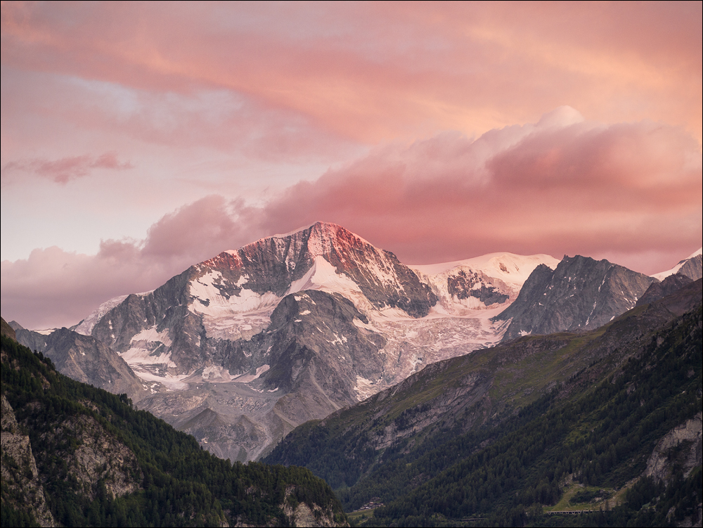
Nice image btw!
Roeland
Hi Roeland,
If you are setting up a digital darkroom and workflow make a ColorMunki Photo a must have tool and investment. It will save hours of frustration. No it doesn’t matter if you use Mac or PC. I use a PC but actually think the Mac has a much clearer and brighter screen even when both a calibrated (I have used them side by side). If you go for a PC ensure you buy a good screen. I use a Dell Ultrasharp 24″ which is nice and can display a goor proportion of the Adobe RGB colour space. Its good value for money but if you have a larger budget take a look at some of the specialist monitors that can cover most of the Adobe RGB colour space. Avoid using a cheap monitor if you can – this is where the Mac score highly. Place your monitor against a wall with no windows and ensure any window in the room is at 90 degrees to the monitor so there is no direct light on it. Finally ensure you invest in a daylight bulb – cheap but it makes a big difference.
All the best
Robin
Thanks for all the info Robin. However, I think that two things need to be added to your write up.
1. When printing from either Photoshop or Lightroom you must specify that Photoshop handles colour management & NOT the printer.
2. No matter how much profiling & calibration you do Epson printers ALWAYS print a darker image that what you see on screen so compensation needs to be dialled in to each print to compensate for this.
Regards
Paul
Hi Paul,
Yes you are quite correct that colour management needs to be turned off in the printer. It’s also not just Epson printers that suffer from this apparent darkening. Light reflecting from a surface will always appear darker than light emitting from a device such as a screen. The print density can however be made to adjust for this with good profiling. You need to ensure your prints are displayed under correct and constant lighting conditions. Pigment inks are also affected much more by this than dye based ink. But then again I said I would try to keep this simple and I’m in danger of writing a book on the subject.
Good points though so thanks for adding to the discussion.
Robin
Robin,
Have you noticed that printing from Lightroom and Photoshop using the same profile produces different results? Admittedly I am using an older version of Photoshop Elements, but it’s really annoying. I created my profile by printing the Fotospeed calibration image through PS Elements 6 and used their profiling service, and the results are good. But printing direct from Lightroom 4 using the same profile and the same rendering intent (Perceptual), the result is paler and less saturated. There must be some inconsistency in the colour management between the two applications, but I can’t work it out. Odd, since they are both Adobe products.
I also have a copy of PS Elements 11 which I never use (I hate the way they have changed the user interface), but perhaps I should check whether this version behaves any differently. Perhaps it’s all a ploy from Adobe to force me to buy a full version of Photoshop (ain’t gonna happen!).
Ed
Hi Ed,
I haven’t noticed this however I gave up trying to get good printed results from Photoshop some years back and consequently never bothered with Lightroom. I now do all my printing from a product called Qimage as it gives me great control and the results are visibly superior. It doesn’t however surprise me what you are saying as different Adobe products and even versions of the same product use different versions of the Adobe colour engine which I thik is what drives printing.
Save yourself some heartache and download Qimage.
Robin