If I go back about 10-15 years, photographers regularly had prints made and shared these with other photographers so that work could be discussed. The film you shot would also determine how you shared your work. If you shot B&W or Colour print film you might have small 7×5 prints made when your films were developed and perhaps you would have an enlargement made of anything that really impressed you. If you developed your own film (usually black and white) and had access to a dark room, you might make your own enlargements. In rare cases you might also have access to equipment to make your own colour enlargements. Finally, if you shot slide film you either looked at the slides on a lightbox or projected your slides. Having a print made from a slide was rare and expensive with few labs offering this service.
Then the inkjet printer came onto the scene and the quality and ease with which a print could be produced improved. This was further fuelled by a switch to digital by many photographers and now we most photographers could make A4 and often A3 prints. Strangely, despite this ease, many photographers seem to have dropped printing in recent years in favour of sharing their work on the Internet. To me, this is a real shame because something is lost from the creative process when you don’t make a physical print of your work. This is not because there is an extra creative step in the printing but because printing helps you really appreciate an image as often leads you to refine and improve it further.
When you hold an A4 or A3 print of your work you tend to assess it differently to how it is viewed on the screen. Part of this comes down to paper choice which can have a huge impact on the end result. For a start there are different paper surfaces such as Matt, Gloss, Lustre, Perl, Silk etc. Then there is the base for the paper as well as the colour of the print surface. There are so many creative choices that you can waste a huge amount of time and money searching for papers that suit the style of your work and your creative desire.
Unfortunately you don’t really appreciate all the different subtleties of the different papers until you print a lot. By this time you might have purchased lots of different papers only to find out that you don’t like them or that they can’t produce the depth of image that you desire. I know this because I have shelves full of different types of paper. Some of these were relatively cheap and almost without exception the cheap papers don’t give a feeling of depth to the printed image. Instead the image seems to just sit as a flat image on the surface of the paper. If I compare this with one of my favourite papers (Ilford Fibre Gold), the images seem to have a depth to them that would allow you to almost reach into the image with your arm; they feel almost three dimensional.
If I were to generalise, the papers from the main well known manufacturers (Canson, Hanimuhle, Ilford, Permajet, Fotospeed) seem to produce this feeling of depth. Many of these manufacturers produce standard photo papers and fine art papers and it is the fine art papers that tend to produce the better results. It’s then a matter of choosing a surface that suits your intention. I personally like the Fibre Based papers (they feel like a traditional dark room paper) with a silk semi-gloss finish and a neutral to warm tone base colour.
Of all the papers I have used, the Ilford Gold and Permajet Fibre Based Photo Art Perl 290 papers are my favourites by far. They are superb for both colour and black and white and suit all types of images.
Very recently Permajet released a new paper type called Titanium. This is a Metallic paper surface which is similar to the Kodak Metallic paper offered by some photo labs. I find this very interesting as I haven’t seen a Metallic paper for Inkjet printing before. Having used metallic paper with lab prints in the past I know that it will produce very vivid colours and deep Black and Whites. Place prints made with this type of paper in sunlight and they come to life in a way that other papers can’t. I was very keen therefore to try out some of this paper but the results are a little mixed.
The surface and colour are what could only be described as metallic in appearance. The colour is therefore quite a departure from what I usually work with and I can’t make up my mind it I like it or not. The colour prints are quite good but the paper seems to open up the shadows a little more than I would have liked and the colour intensity therefore suffers a little. I think this paper has a huge dynamic range and would suite colour HDR images quite well. In terms of black and white I can only describe the performance as superb. The images look as though they are standing off the paper. This again is quite different from my other papers where the image seems to go into the paper to give depth.
Would I recommend this paper?
Probably if you need the specific look it produces. I don’t think it’s a general, “suites everything” type of paper and therefore it won’t be replacing my Permajet Perl (which is my main paper of choice). I do however think it is worth experimenting with if you are a keen printer and want something a little different.
I hope you have found this little diversion into the world of printing interesting and that if you don’t already produce prints are encouraged to do so. We need to share our work as physical images not just as photons radiating from a screen.

Hi,
I couldn’t agree more with that last sentence you wrote. However, what for now keeps me from buying an inkjet is all the calibration and synchronising between computer, screen and printer people say is needed to get the colors right. Is it really that horribly difficult? Isn’t there a simple procedure you can share us that allows us accurate reproduction of colors as well as b&w? I tend to agree with you that different types of papers mean different characteristics of the end result but without proper basic settings I think one would easily get lost into trying to approach the right print. I am not at all an experienced “printer” nor do I posess all the knowledge about it so I could be wrongly informed.
Best regards
Roeland
Hi Roeland,
You are quite right that you need to have both your screen and printer calibrated to get the prints to look right or the whole thing can be very frustrating. The best way to do this is using a ColorMunki from X-Rite which will calibrate both your screen and your printer for an paper you decide to use. This ensure both colour and black and white prints display correctly on screen and print accurately. The downside is the expense. You could just use a screen calbration unit which is much cheaper but you still need to have your paper calibrated. Many of the paper manufacturers have colour profiles that you can download from their website for many of the popular printers. Using these will get your prints looking pretty good. A very good option however is that when you buy either Fotospeed or Permajet papers you can have a free custom profile made for your printer. This involves printing a target image on their paper and then posting this to them. They then analyse this and email you a custom profile for your printer a few days later. I have used this service and itsw excellent. Some other manufacturers may offer something similar but I only know of Fotospeed and Permajet.
Hope this helps
Robin
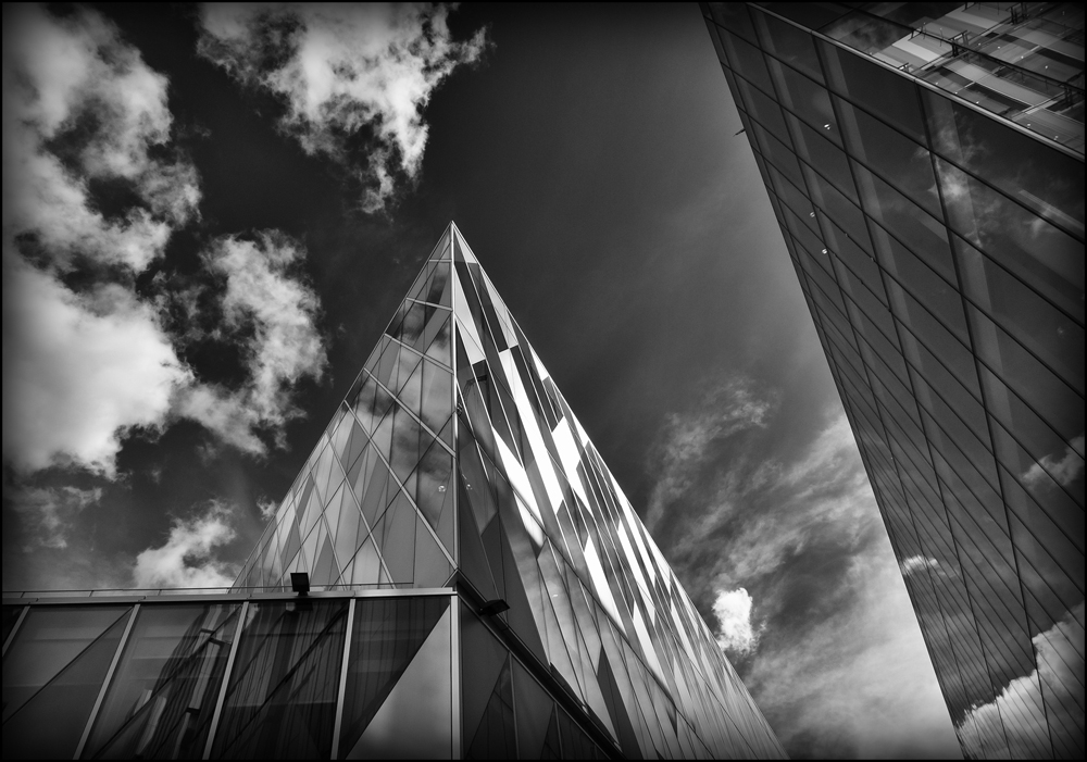
What a beautiful photograph, and thank you for all of the information here!
Hi Lisa, I’m pleased you like the photograph and blog.
All the best
Robin