Recently, I’ve begun experimenting with colour in my photography. By this, I mean using processes like colour grading images to create an atmosphere or mood.
Take this example of the Bodleian Library in Oxford.
I shot this about five years ago but was never happy with the image. It wasn’t until I decided to apply colour grading to the image using the Nik Collection that I achieved what I wanted. Previously, the image felt like a faithful recording of a scene, but once I applied colour grading, it added something.
I then found myself happy to make other changes, like removing unwanted buildings and adding a sky from another image. My objective was to produce something more dramatic and artistic than photographic. If you want to see my processing steps, I published them on Instagram including the starting image.
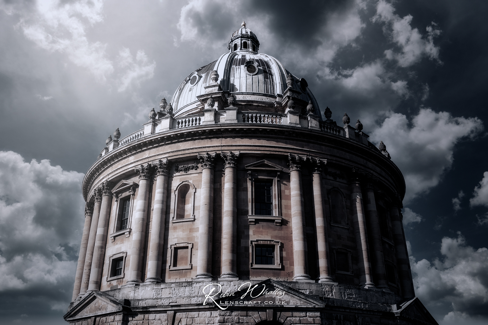
Here’s another example that I have struggled to process in the past.

This was also captured in Oxford on the same day as the previous shot. I have yet to publish it on Instagram, but the editing steps are similar to those for the other image.
What I’m enjoying about the colour grading process is not only that it creates a more interesting and atmospheric image, but it makes me feel free to apply other editing like replacing the sky. Somehow, I don’t feel that I’m cheating.
I hope you like the images.

This is actually interesting. I like your results.
That’s good to hear. I’m having fun and will probably share more about this in the future.
As long as you don’t mind that it’s no longer a photographer.
I don’t care whether it’s classed as a photograph or digital art. The end result of the image is what’s important to me.
I’m pretty much of a purist. But I do like your blog and read it regularly.
It wold be a boring world if we all thought the same way and liked the same things.
An interesting edit and I really like the result. Many thanks for letting us know the steps you have used – most useful
You’re welcome and I’m glad you found it helpful.