This week, I didn’t just want to share an image. Instead, I wanted to talk briefly about one of my favourite photography principles; less is more.
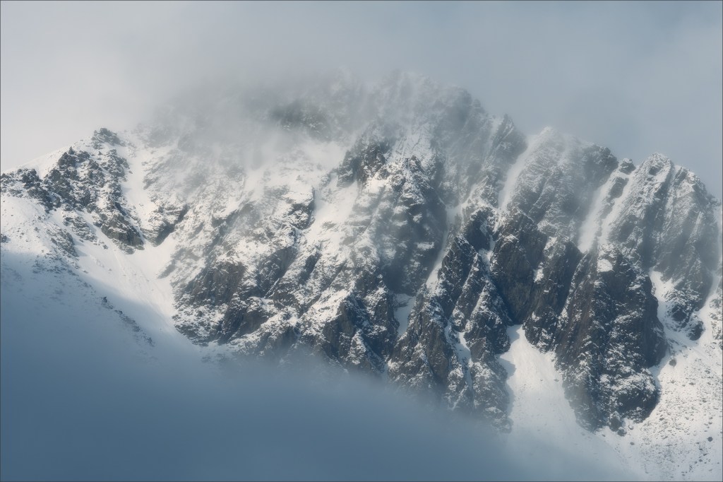
You can apply this principle in all sorts of ways. For example, you can apply it to composition by deciding what to leave out of the frame. In this image, I could have included the entire mountain rather than the very tip. That would have given the image a different feel. I could even have included the entire range of mountains but that was incredibly boring.
No, it was the very tip of this mountain that caught my attention. It was the sun breaking through the cloud that I liked so that’s what I’ve focussed on. Less is more.
But another way you can use the less is more principle is with colour. An example from this image is the very limited colour palette. Other than the blue/cyan of the clouds there are very few colours in the colour palette. This tends to create a different feel to an image where there’s a wide range of colours from the entire colour palette. I personally find images with a limited colour palette more soothing than one with colours from across the palette. So, when I came to edit the image, I deliberately limited the palette.
A final application of the less is more principle is the colour saturation. Even where colour does exist in the image the saturation is very low. Strangely though, this makes the colour appear somehow stronger.
So please remember and practice the principle “less is more”.
Fuji X-T2 with Fuji 55-200 at 135mm. ISO200, 1/320” at f/11.0. Handheld, no filters.
Have a great weekend.
