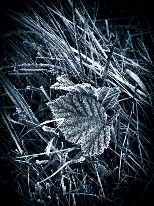
My last post has drawn some interesting feedback on which image people like best and why. The thing I find fascinating about this exercise is not only do we tend to favour one image over the other (most of the time), but we tend to do this for different reasons. I have just read a great comment from Paul making the point that the different tones in the surrounding grass, some dead and some alive is distracting as well as the direction of the grass. Whilst I also see this (more now Paul points it out), it doesn’t cause me any issues with the colour image. In fact it makes it feel more natural to me.
Another comment from David talks about liking the subtle graduations in tone from the colour image. This is also my perspective and what I find so attractive about the colour image. I do however also like the sharpness and clarity of the black and white image BUT wouldn’t want to see that reproduced in the colour image. I feel it would lose it’s subtly if that happened.
This suggests to me (perhaps this is obvious to others) that when we assess an image we each favour different qualities over others. Some of us look for strong shape and form in an image and judge this to be the priority. Others look for subtle graduations in colour and tone ahead of other factors. Maybe other favour texture over everything. Perhaps if we develop an awareness of how others see photography we might develop a more rounded view ourselves, which could lead to our performance as photographers improving.
So enough of the psycho analysis. I wanted to share a few more versions of yesterdays image, adopting some (not all) of the suggestions made.
Any favourites?


The last two images are my preference, but the colour one sneaks it, for me at least.
Reblogged this on Photos That Inspire Words.
Thank you
I still prefer version 1 as I like to be allowed to let my eye roam across the whole image before I settle on the main focal point as opposed to being forced to go straight to the focal point as in version 4 & not enjoy the rest of the image. I think version 1 is fine providing the focal point is dominant in the image, but my opinion may chage if the focal point is not so apparent in which case the viewer may need some help bur never as strongly as in version 4.
Wow! I’ll shut up now.
Thank for your input Paul. I do enjoy hearing other peoples views. It’s amazing how som many variations of the same image can create such a variation of feeling.
#2 for me – I think this image is one of those instances when (to me) there really is only one real point of interest and to really study it requires the minimum amount of distraction – mono prejudice admission on – but all the treatments show how much more can be made of quite a simple colour image.
Thanks for your thoughts Steve. It is interesting how we can do so much with what is an otherwise quite ordinary shot. I must root out some others along a similar theme but which I think are better. I suspect they will also draw a similar level of disagreement.